Usage
pnpm add astro-image-zoom@betaPut <ImageZoom> around any markup with images. It wraps each one in a link to its full-size file, so without JavaScript the link still opens the image.
---
import ImageZoom from 'astro-image-zoom/ImageZoom.astro';
import { Image, getImage } from 'astro:assets';
import photo from '../assets/earthrise.jpg';

// Full-size version for the zoom
const fullSize = await getImage({ src: photo, width: photo.width });
---
<ImageZoom>
  <Image src={photo} alt="Earth rising above the Moon" width={800}
    data-zoom-src={fullSize.src} data-zoom-caption="Earthrise — Apollo 8, 1968" />
</ImageZoom>
Why data-zoom-src? Astro's <Image width={800}> generates an 800 px file, and the zoom never shows an image bigger than it is: it would open that small file, at 800 px. Pointdata-zoom-src at a bigger version. Plain <img> tags don't need it: the zoom opens the same file.
Your thumbnails, your styles. The component doesn't style the images on your page, not even their focus ring. Each one gets an inline <a data-zoom-generated> with your link styles, and if your images are display: block, the outline of that link doesn't wrap them. Draw your focus ring on the image instead, as this page does, and add a zoom cursor if you like.
Show code
a[data-zoom-generated]:focus-visible {
  outline: none;
}

a[data-zoom-generated]:focus-visible img {
  outline: 2px solid green; /* your focus ring */
  outline-offset: 3px; /* negative if a parent with overflow: hidden clips it */
}

a[data-zoom-generated] img {
  cursor: zoom-in;
}
Image sources
Astro's <Image> and <Picture>, a plain <img>from public/, or an image on another server.
Prefer <Image> or <Picture>: Astro resizes and compresses them, so the page loads light images and the zoom fetches the full size only when it opens. Plain<img> tags work just as well, but they ship whatever file you give them.
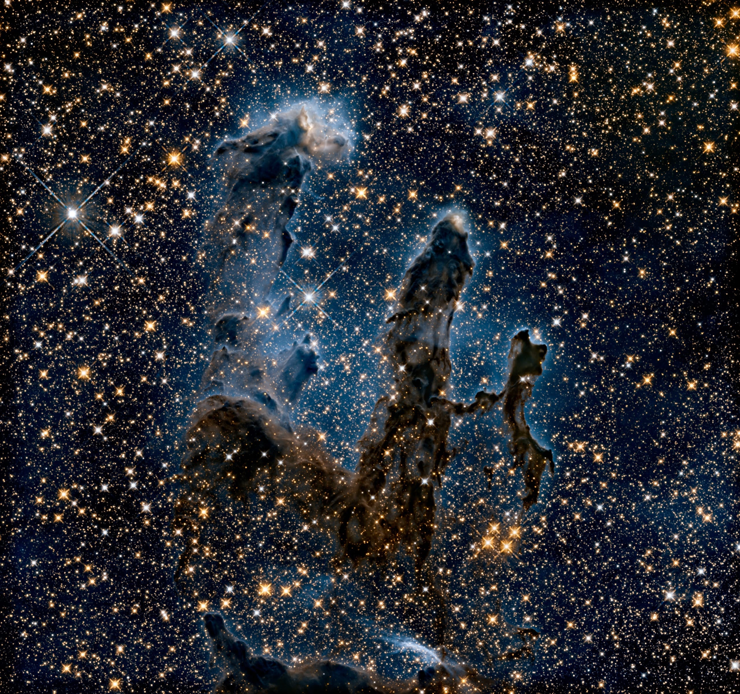
<Image> · Pillars of Creation

<Picture> · Sunflower galaxy
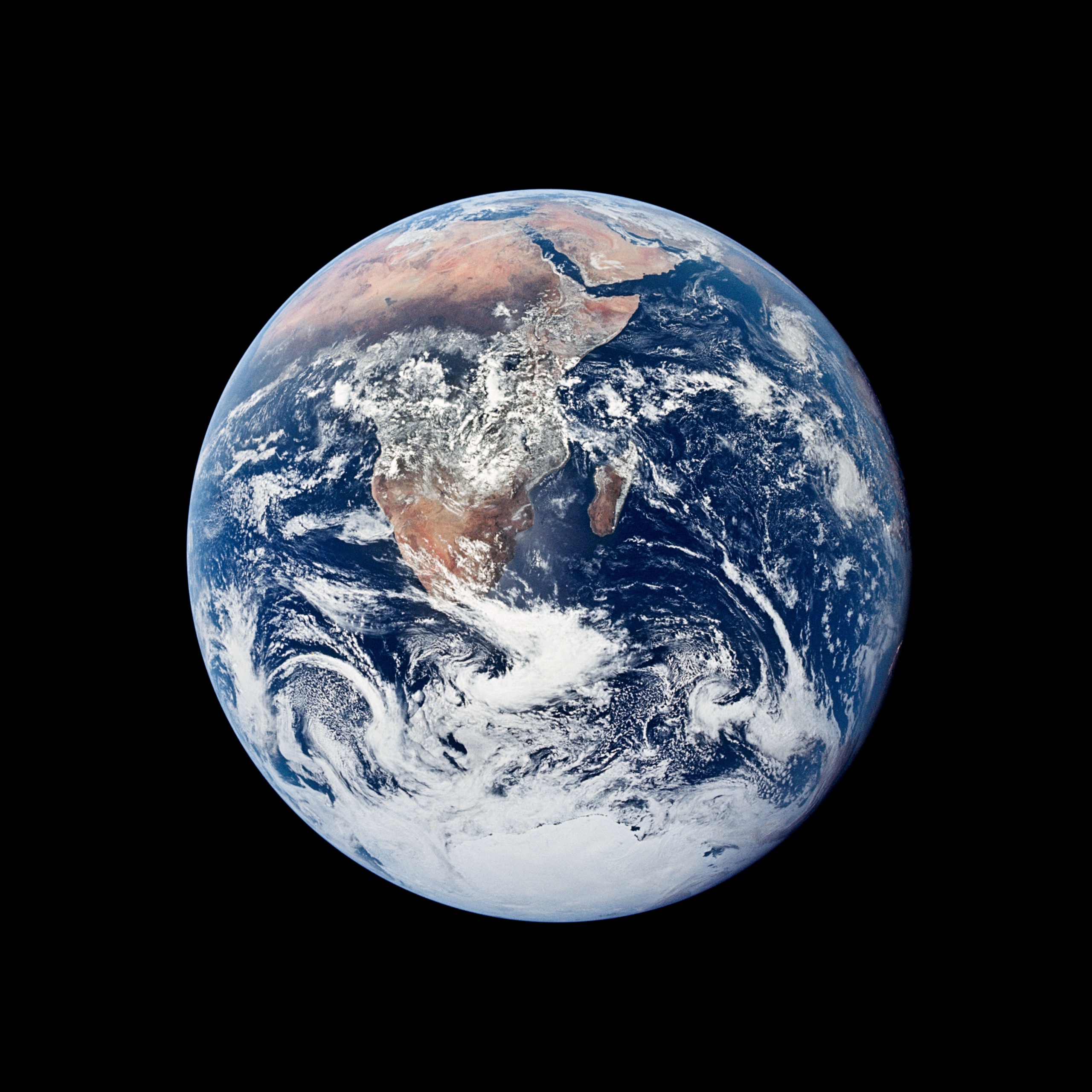
<img> from public/ · The Blue Marble

Remote <img> · Mystic Mountain
Show code
<ImageZoom>
  <Image src={photo} alt="…" width={640} data-zoom-src={fullSize.src} />
  <Picture src={photo} alt="…" widths={[640]} formats={['avif', 'webp']} data-zoom-src={fullSize.src} />
  <img src="/images/blue-marble-small.jpg" alt="…" data-zoom-src="/images/blue-marble.jpg" />
  <img src="https://images-assets.nasa.gov/image/PIA15985/PIA15985~large.jpg" alt="…" />
</ImageZoom>
Nested markup
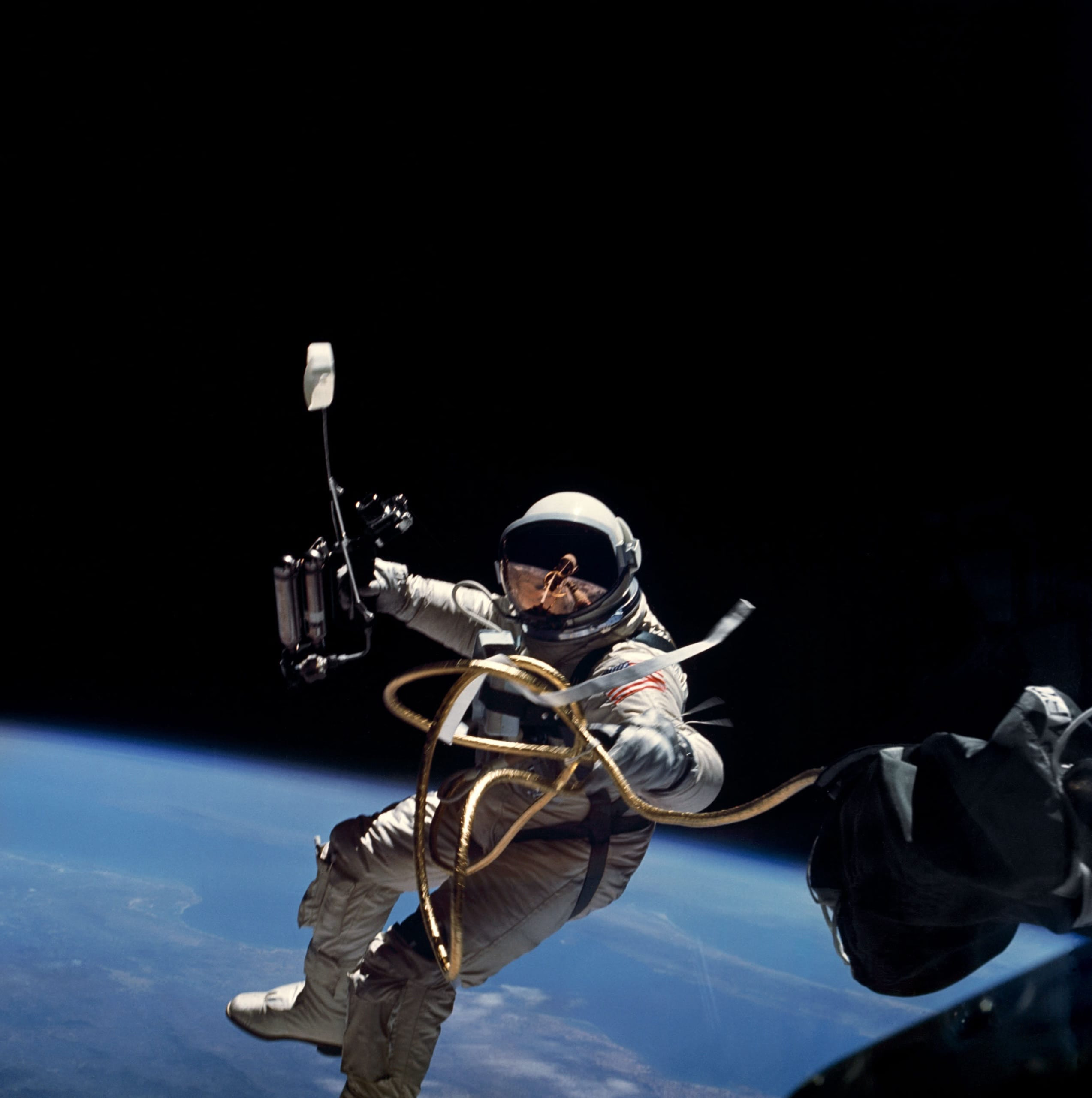
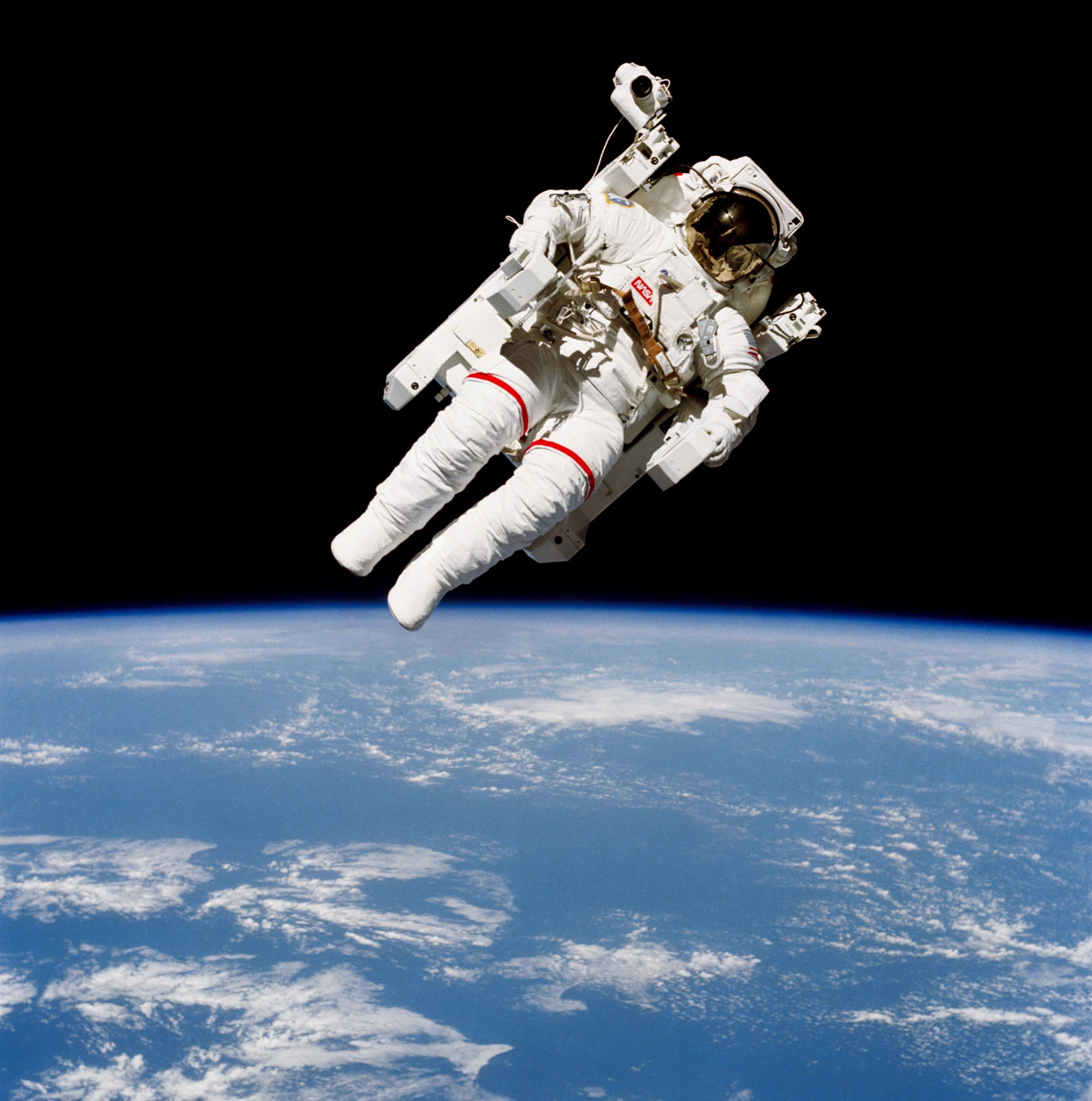
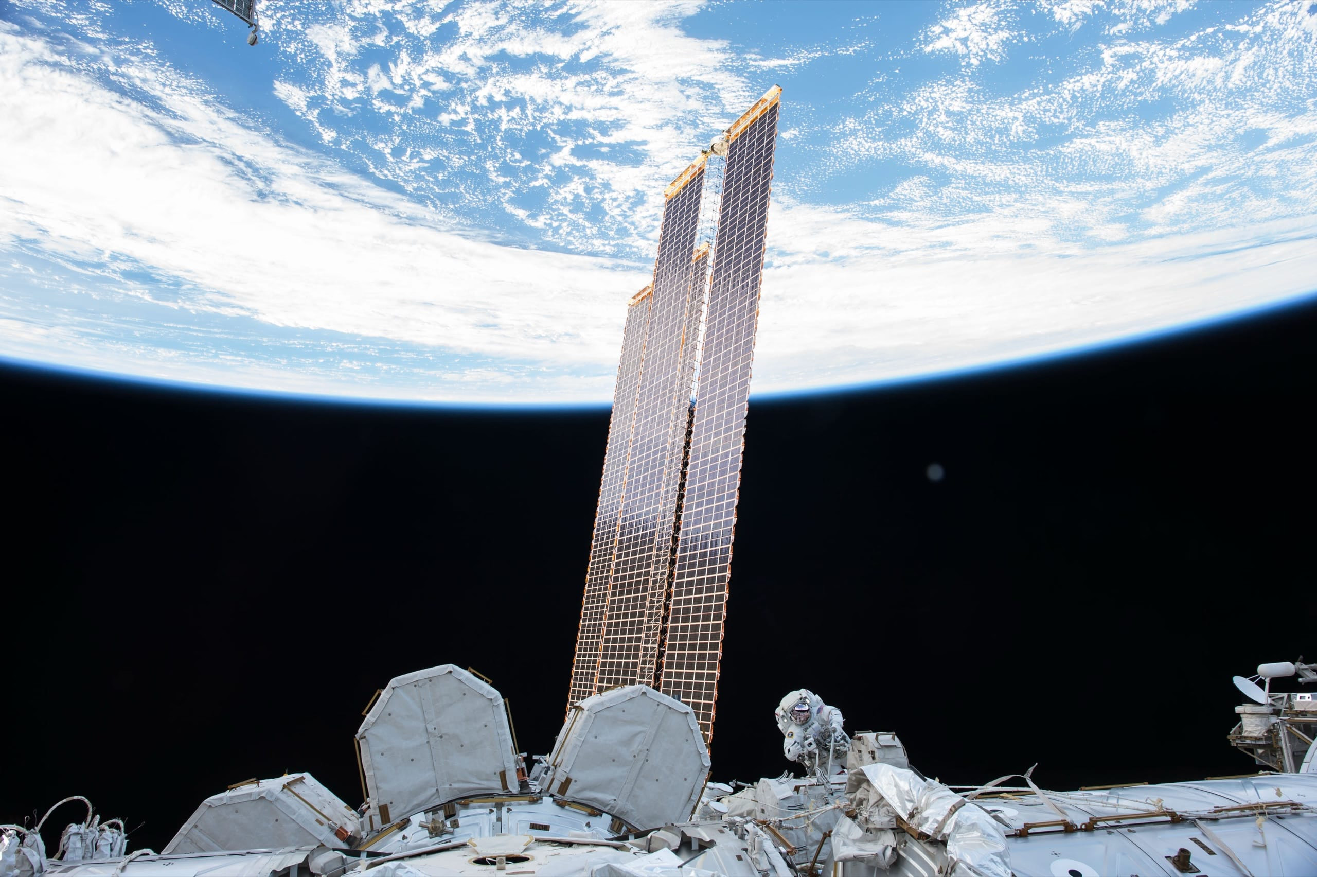
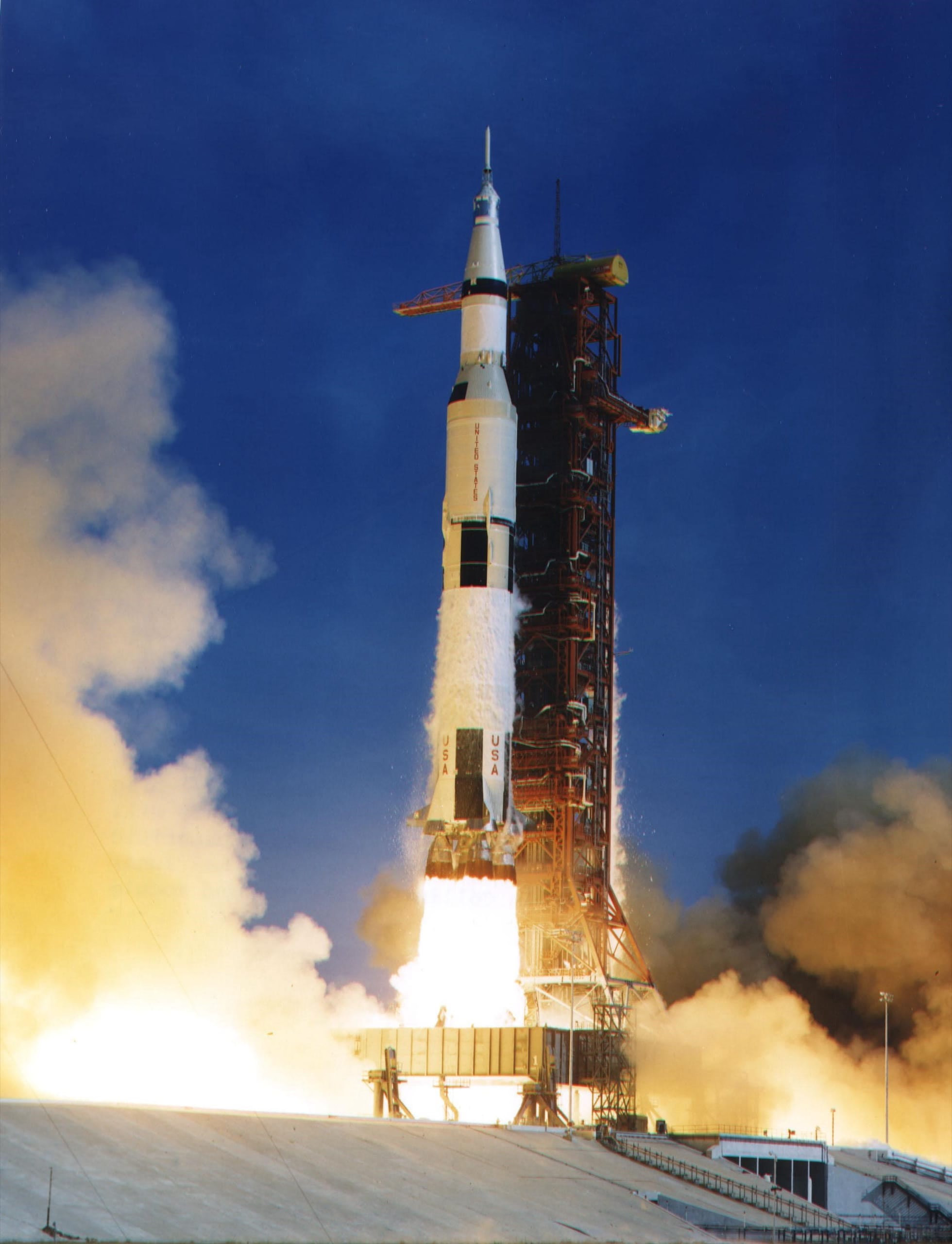
Images nested anywhere inside the component zoom too, like in this card.
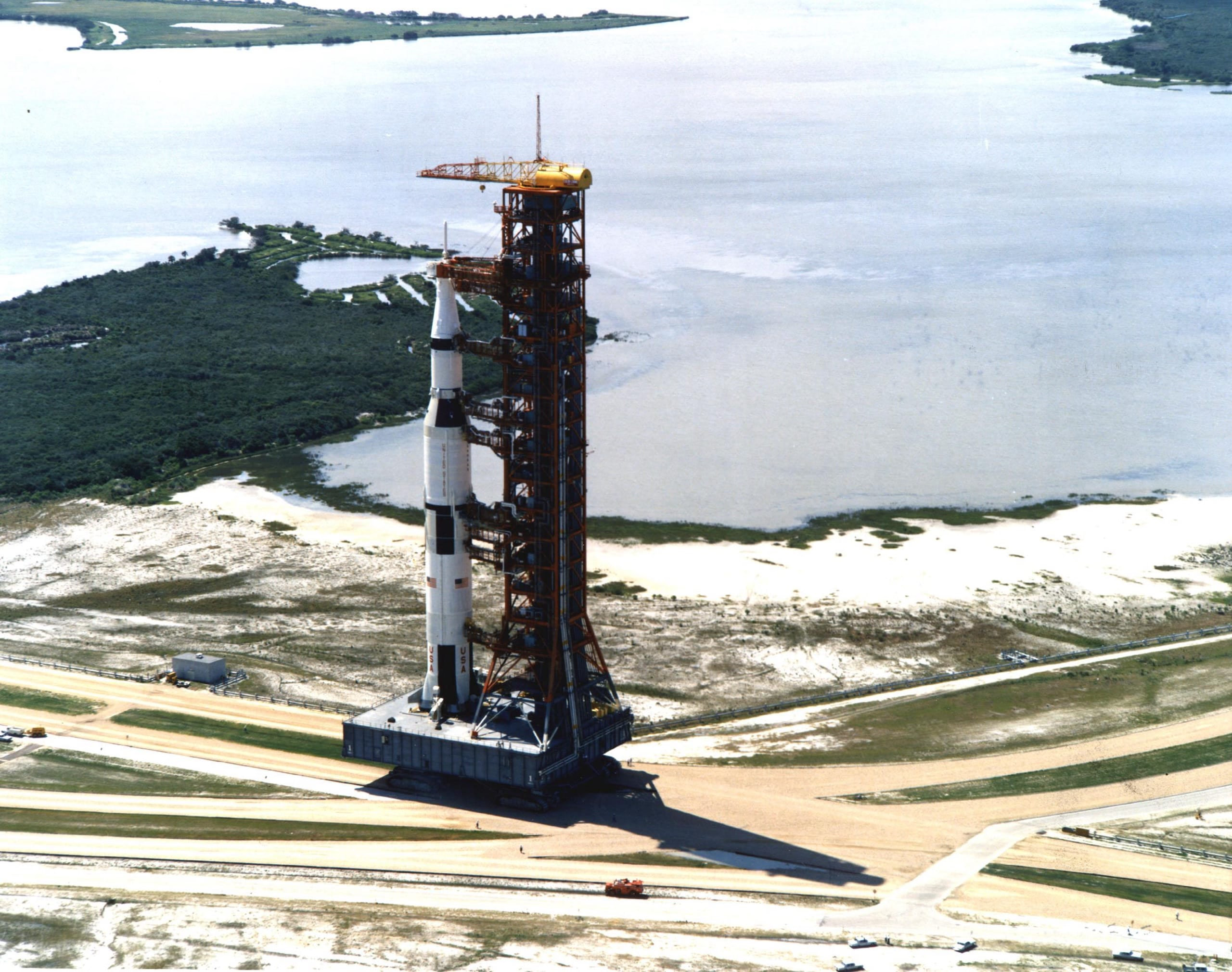
Photo essay · 4 images
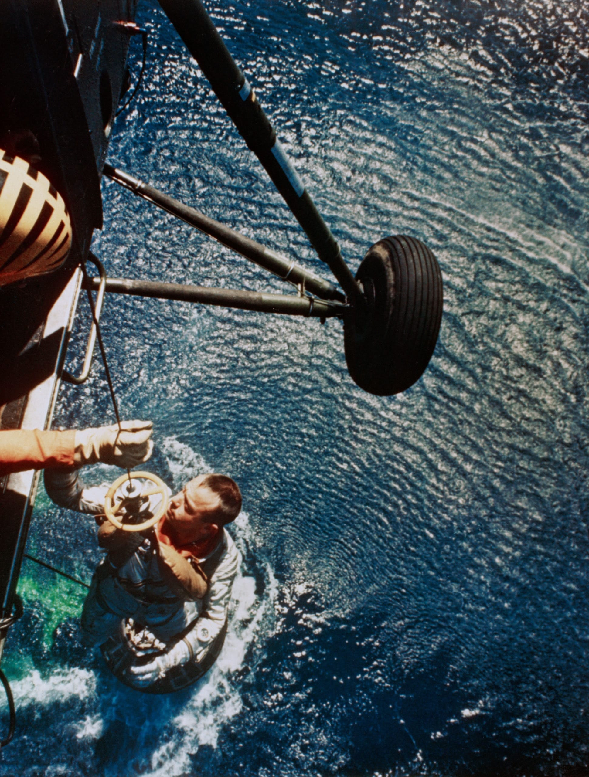
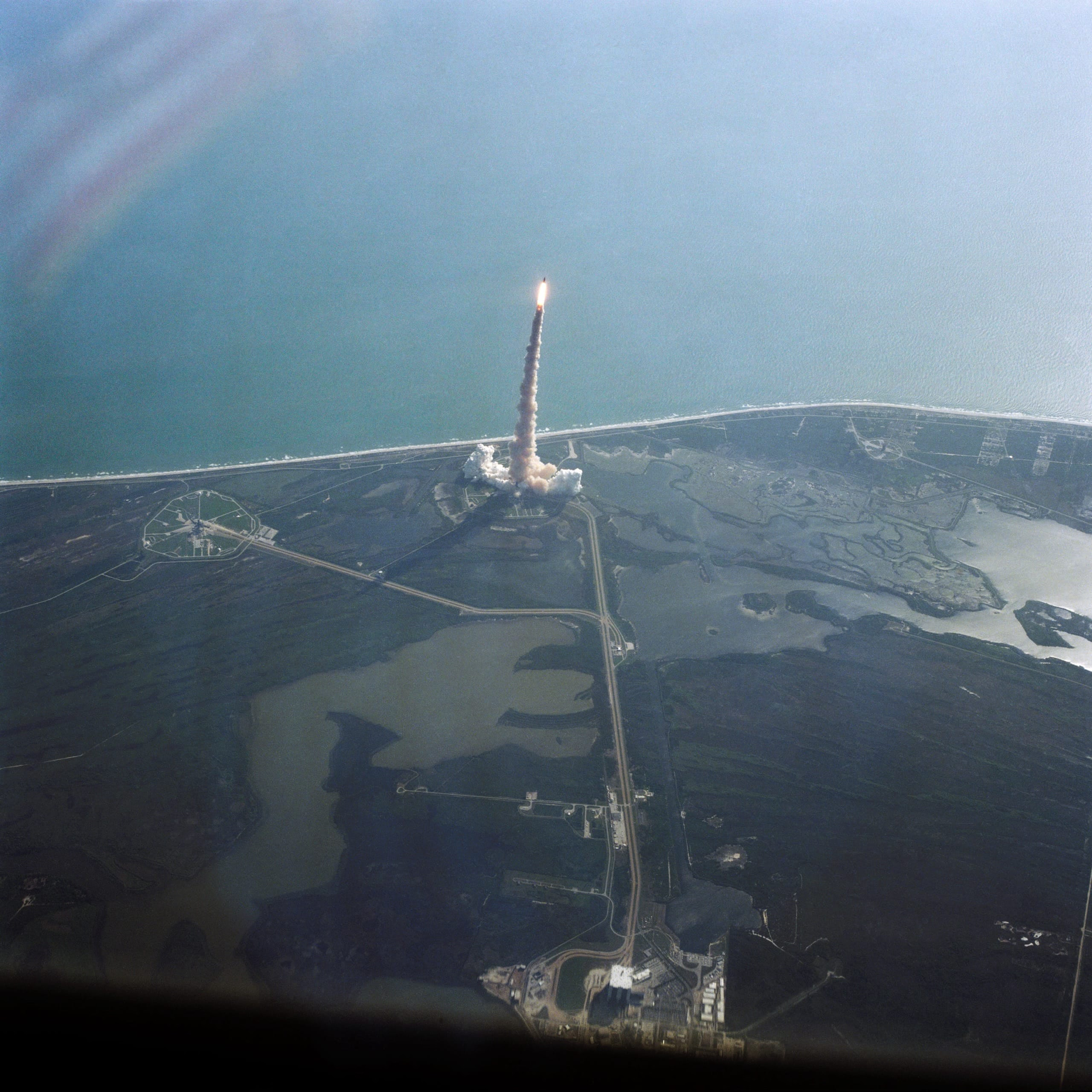
Leaving the pad
From Mercury capsules to the Space Shuttle: how the early crews got to space and back.
Options
Props change how the zoom moves, closes and animates. Open each example to try it.
No arrows or counter
Keys and swipes still move through the gallery.
<ImageZoom showNavigation={false}>
No arrow keys
The arrow keys do nothing. Escape still closes.
<ImageZoom keyboardNavigation={false}>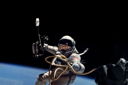
Stays open on a backdrop click
A click on the backdrop does nothing; the close button and Escape still work.
<ImageZoom closeOnBackdrop={false}>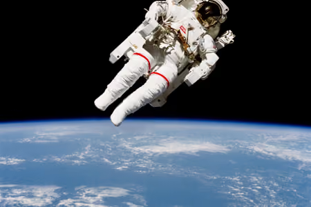
Stays open on an image click
A click on the zoomed image does nothing.
<ImageZoom closeOnImage={false}>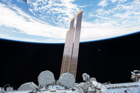
Stays open while scrolling
Scrolling or a vertical swipe doesn't close it.
<ImageZoom closeOnScroll={false}>

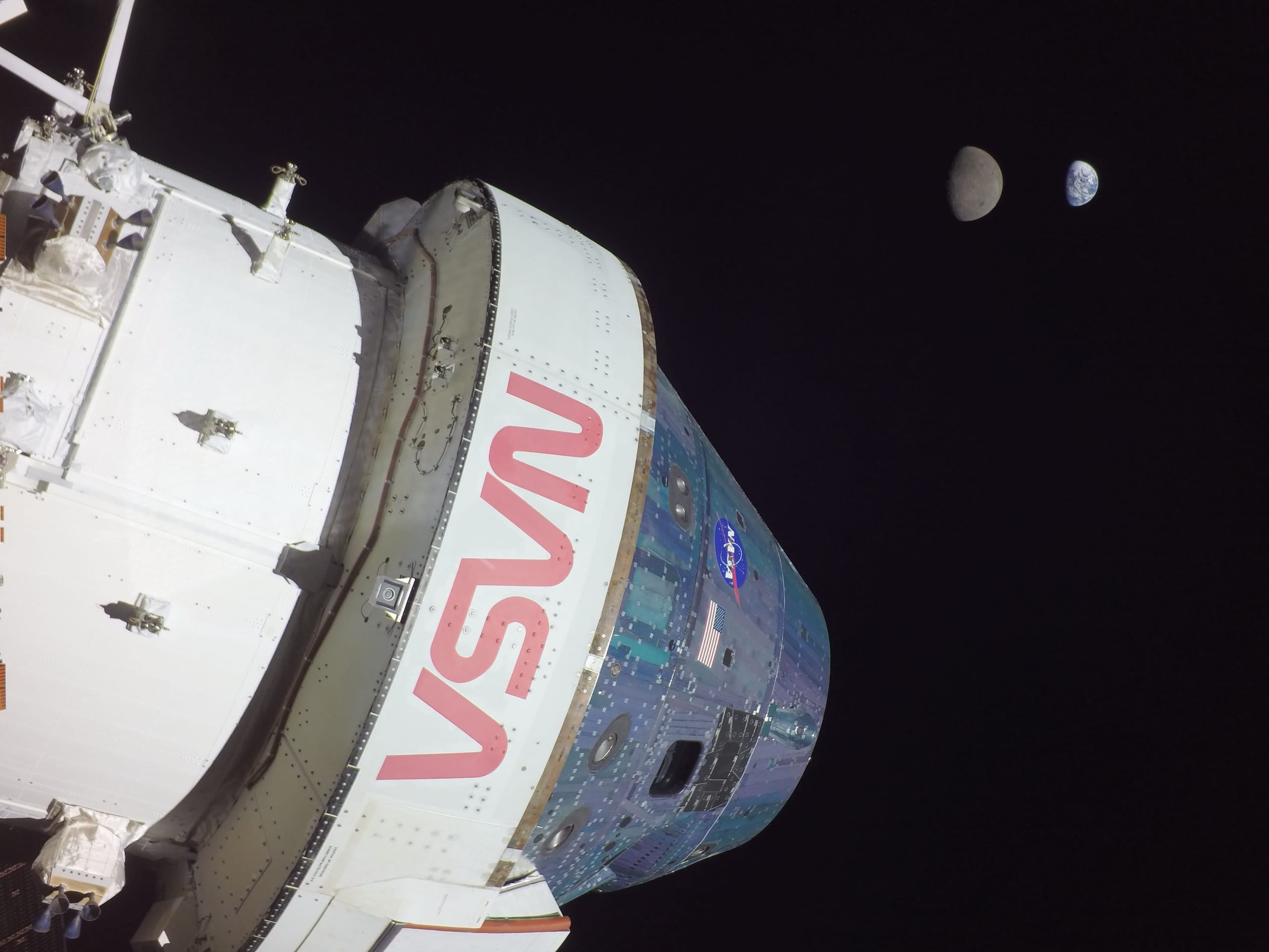
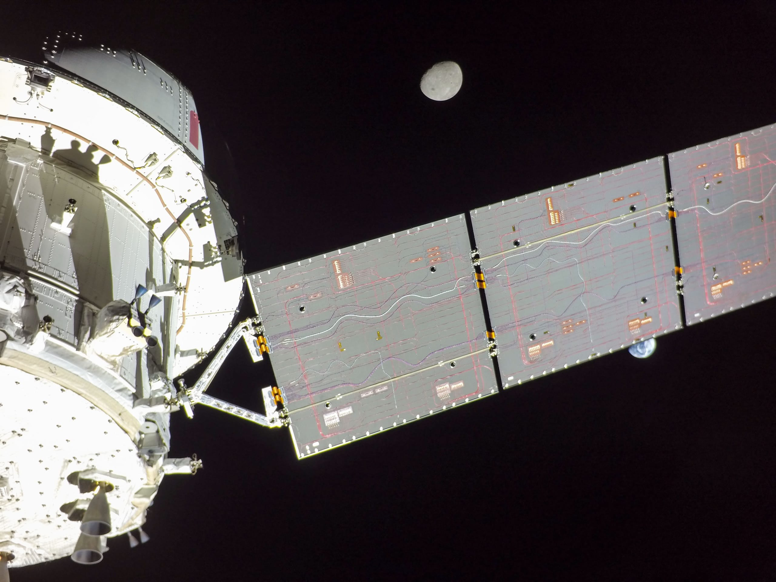
Faster or slower
The length of the zoom in milliseconds: 150 on the left, 800 on the right.
<ImageZoom animationDuration={150}>
<ImageZoom animationDuration={800}>
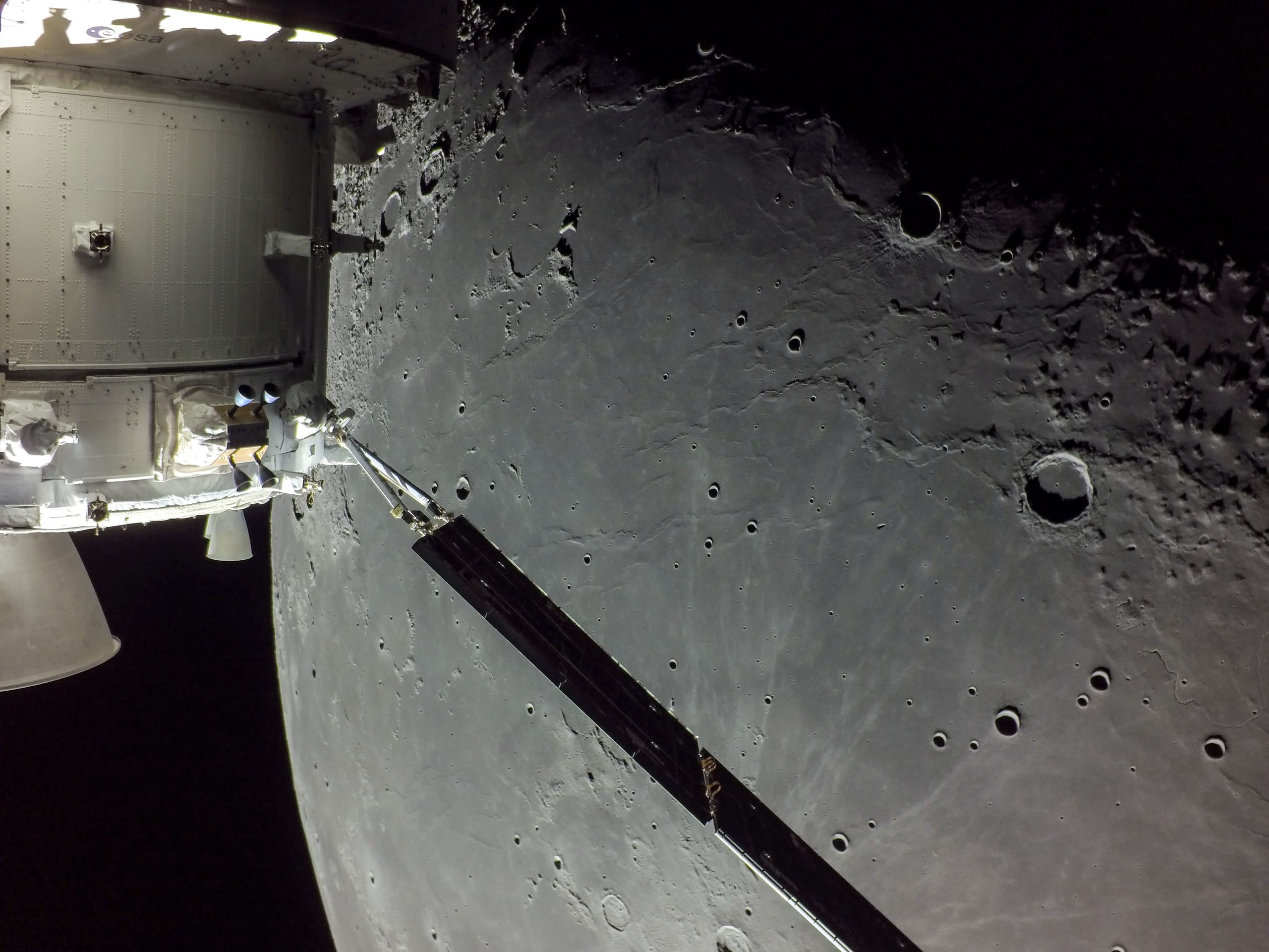
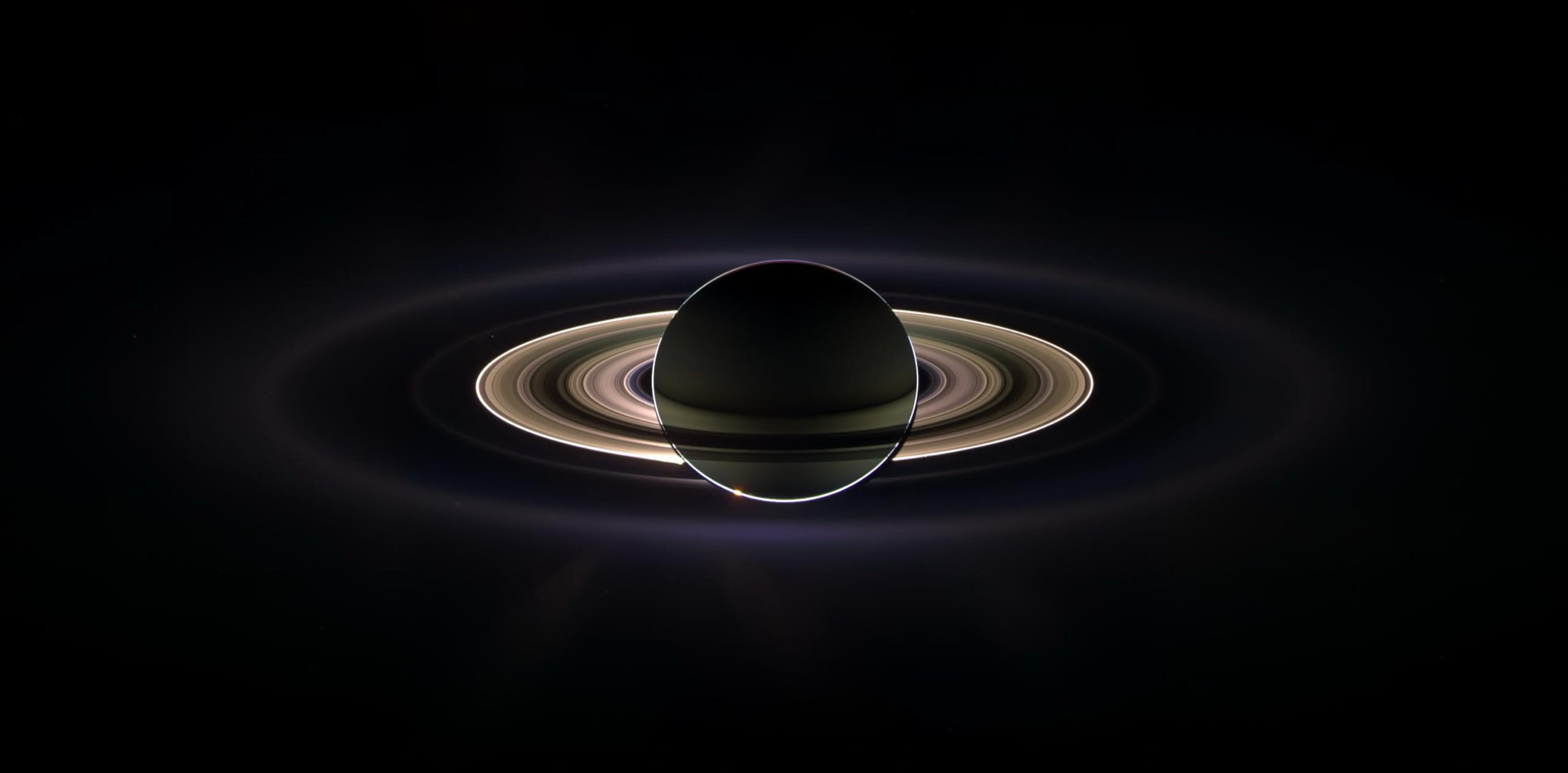
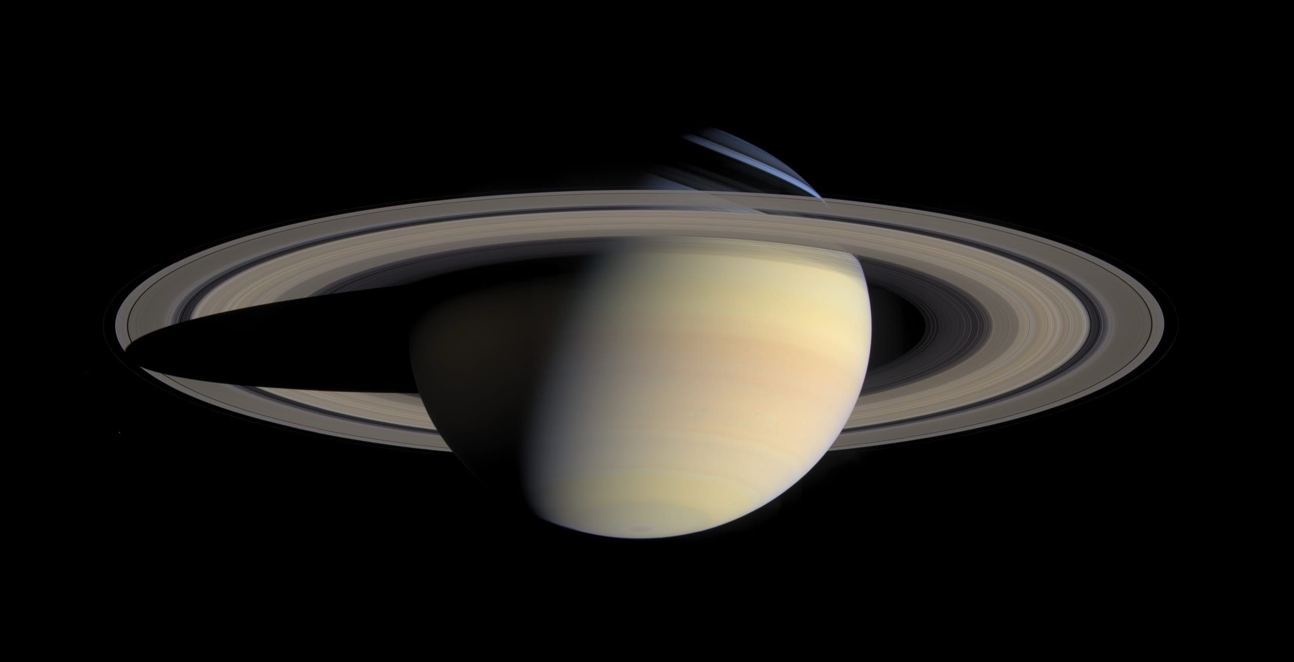
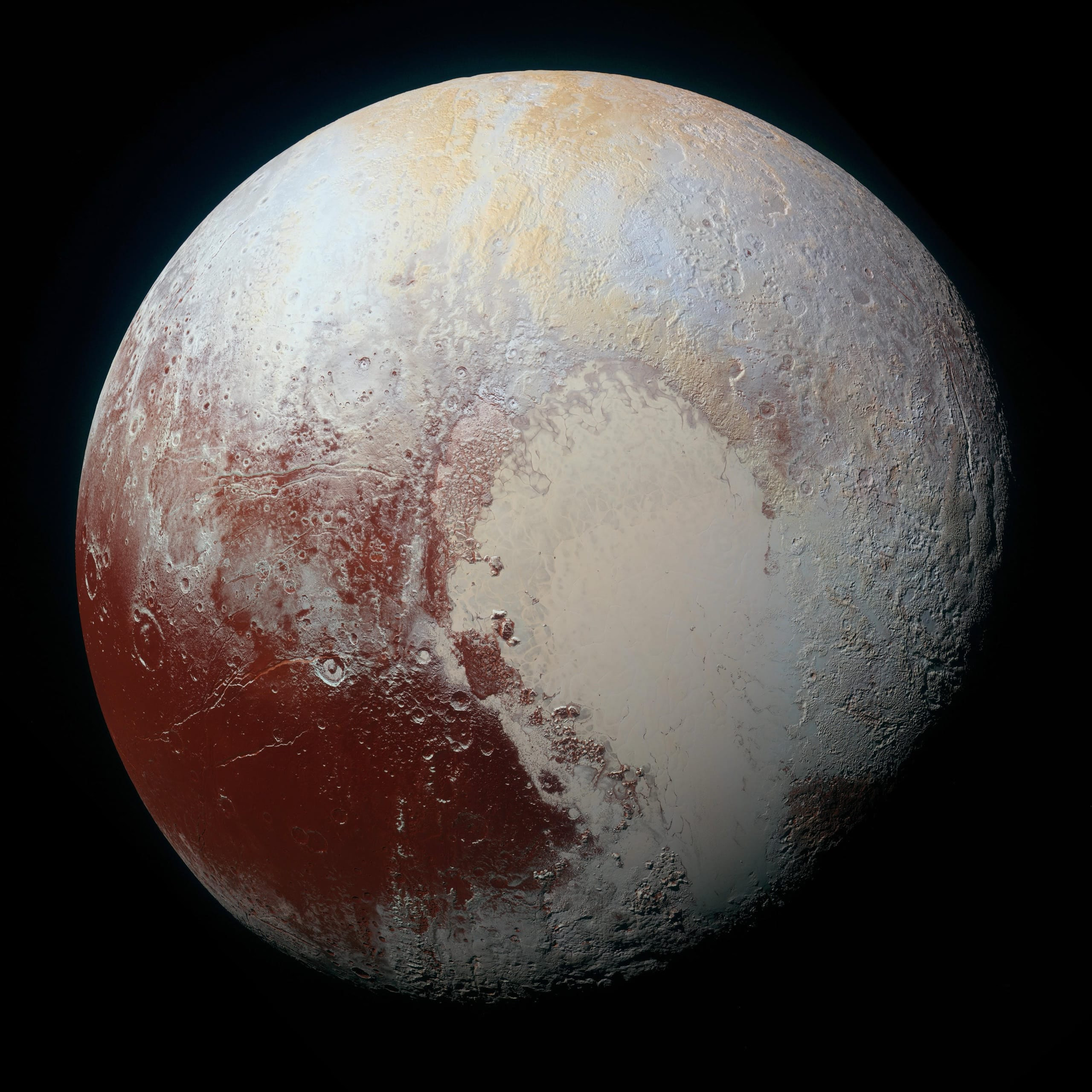
Layout
Props choose where the navigation and the caption go. Spacing, corners and the size and shape of the controls are CSS variables: set them on any element around an<ImageZoom> to change that gallery only, or on :root for the whole site.
The default layout
- The close button at the top right
- The caption at the bottom, over the image
- A bar with the arrows and the counter, in galleries of more than one photo
Navigation
By default the arrows and the counter sit together in a bar at the bottom, easy to reach with a thumb.


Arrows at the sides
The arrows move to the screen edges; the counter stays at the bottom.
<ImageZoom navigationLayout="sides">
No counter
Only the arrows in the bar, without the position in the gallery.
<ImageZoom showCounter={false}>


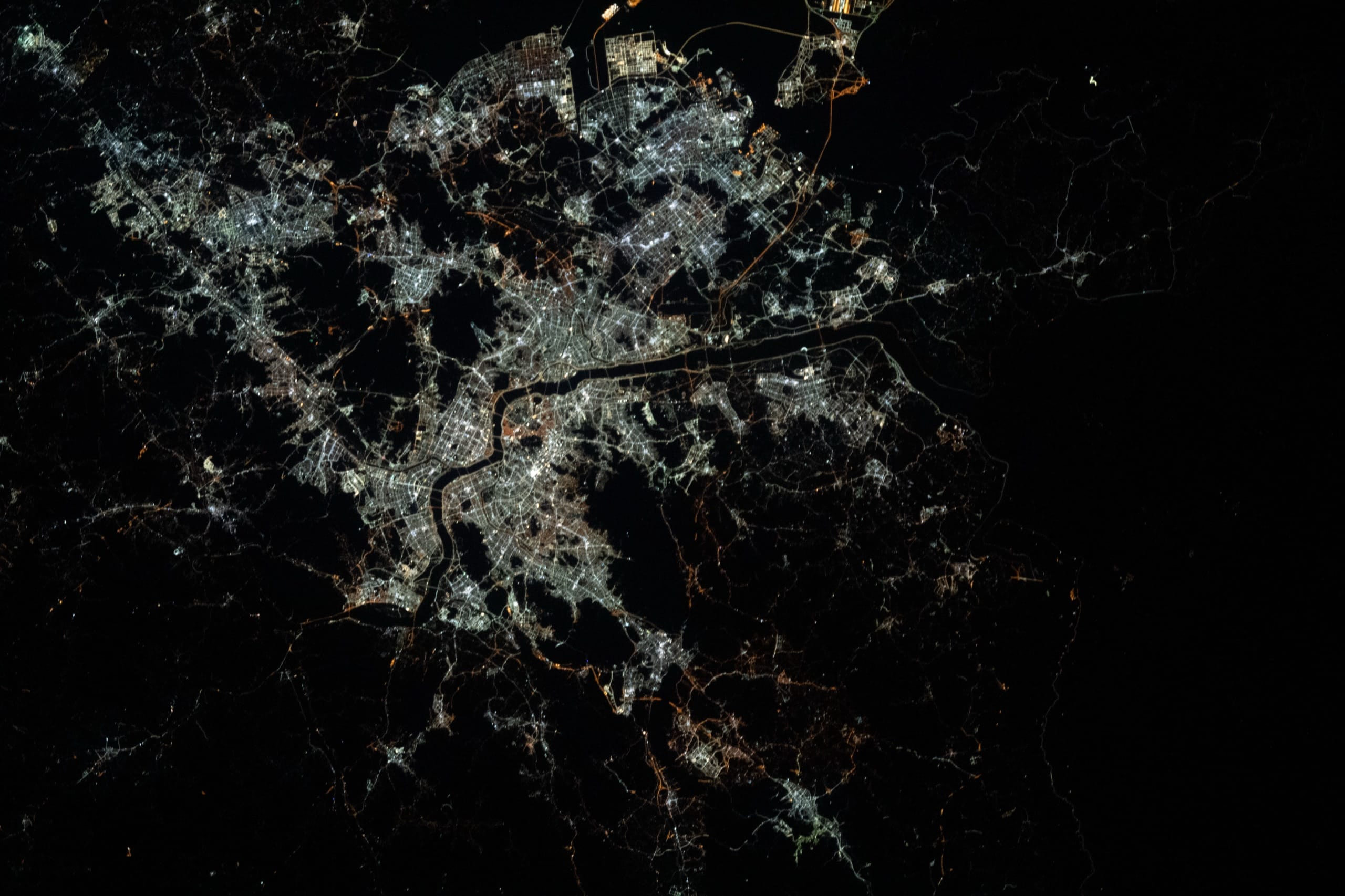
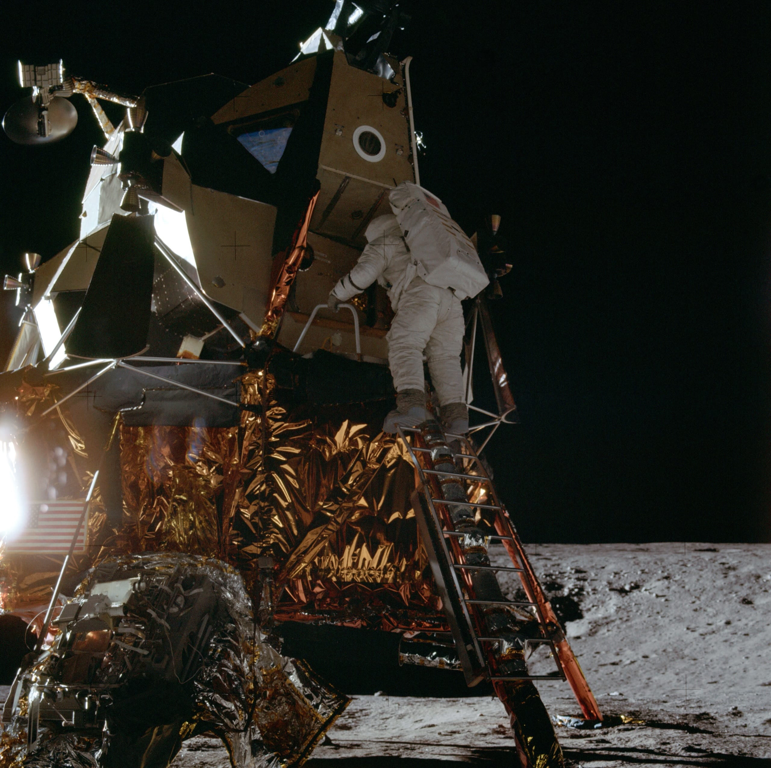
Caption
The caption comes from data-zoom-caption, and sits at the bottom by default.
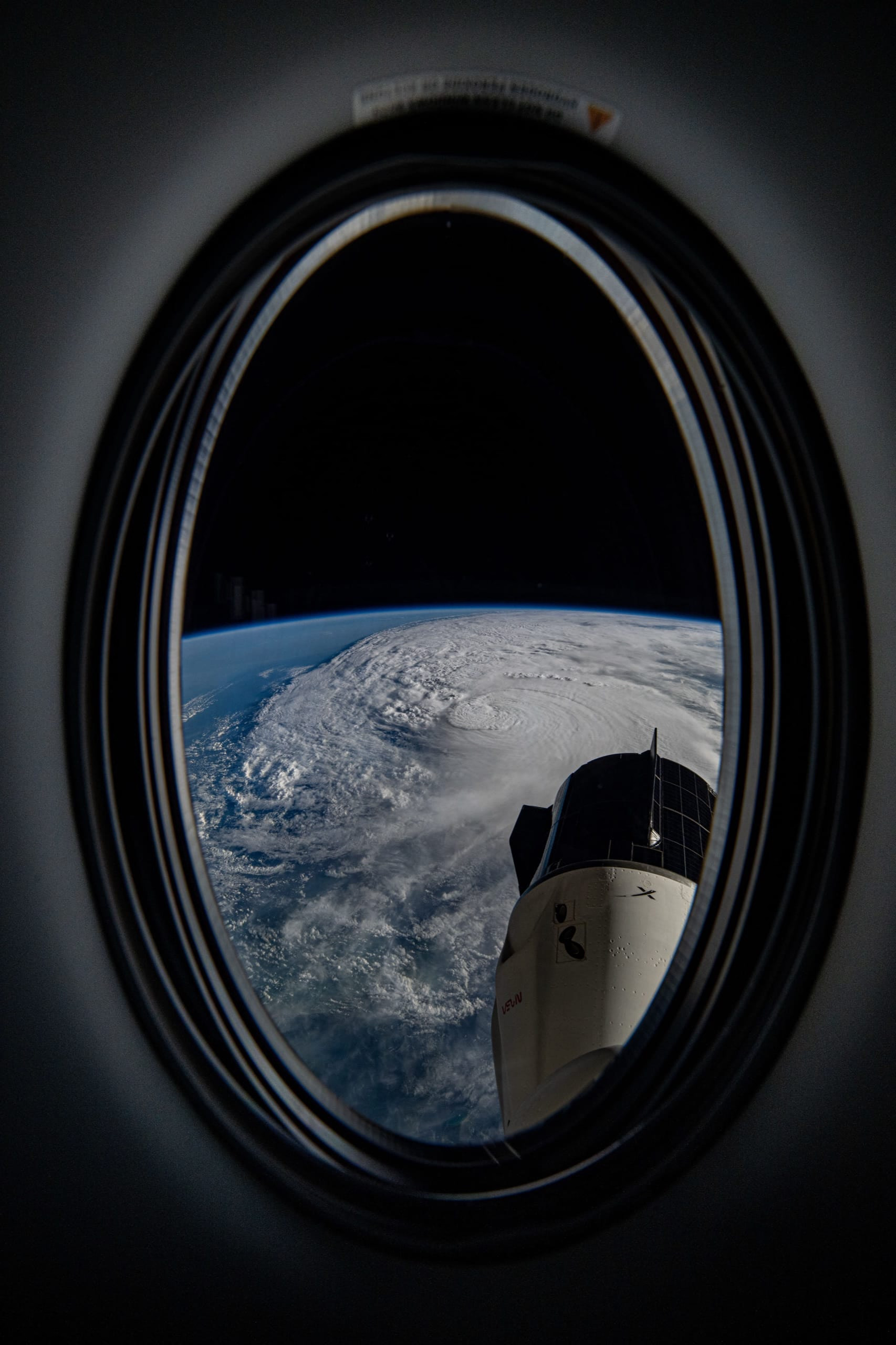
Caption at the top
Useful when the bottom of the photos holds the subject.
<ImageZoom captionPosition="top">
No caption
For photos that speak for themselves. The image keeps its alt text.
<ImageZoom showCaption={false}>
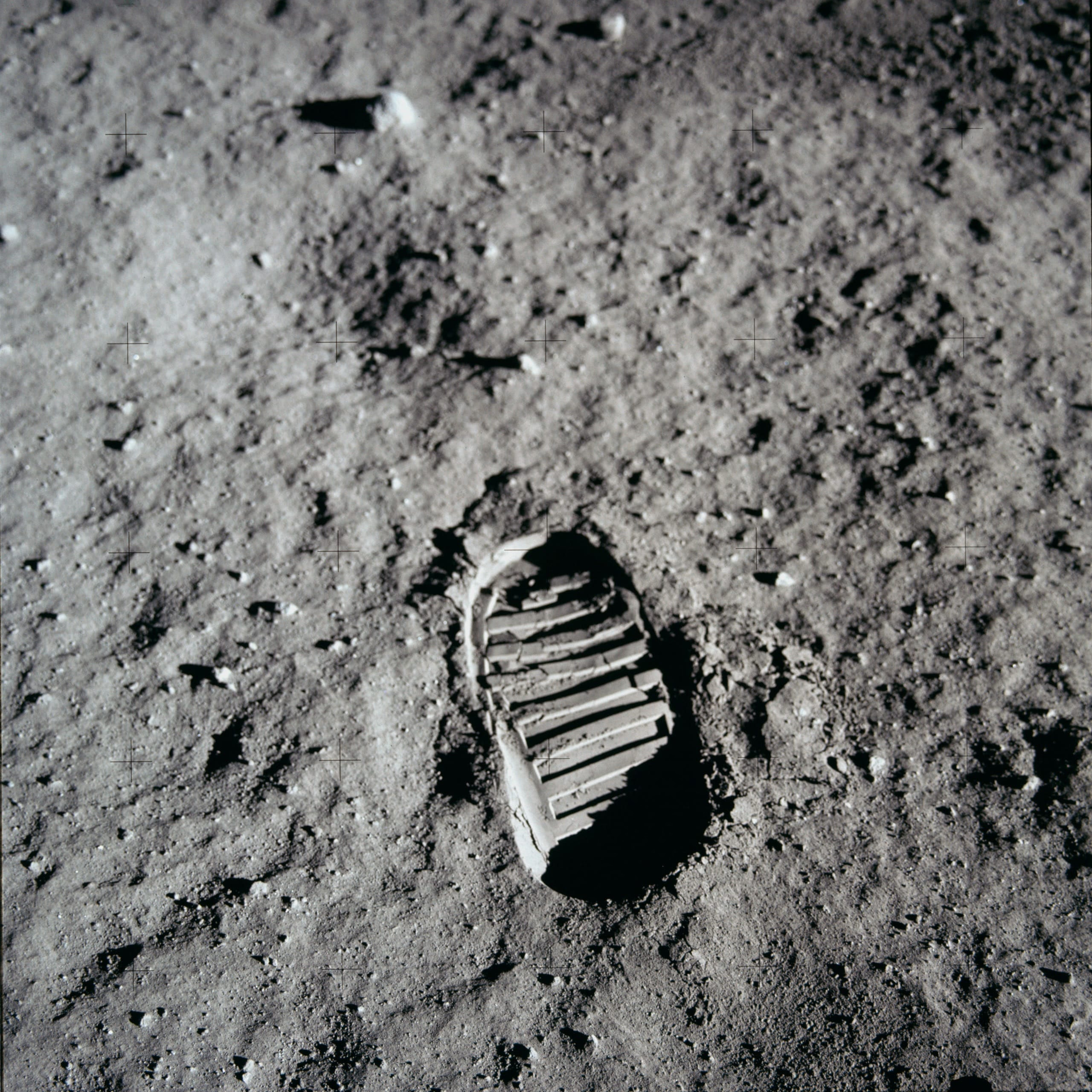
Spacing and controls
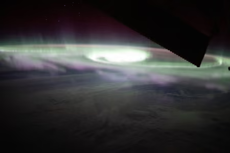
Padding and corners
Room around the zoomed image, and rounded corners.
.framed {
  --zoom-padding: 6vmin;
  --zoom-image-radius: 16px;
}
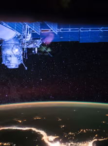
Buttons and caption
Square buttons, a flat caption in the accent color, everything closer to the edges.
.custom-controls {
  --zoom-button-size: 38px;
  --zoom-button-radius: 2px;
  --zoom-caption-radius: 0;
  --zoom-controls-offset: 0.75rem;
  --zoom-caption-bg: #ffb454;
  --zoom-caption-color: #131722;
}
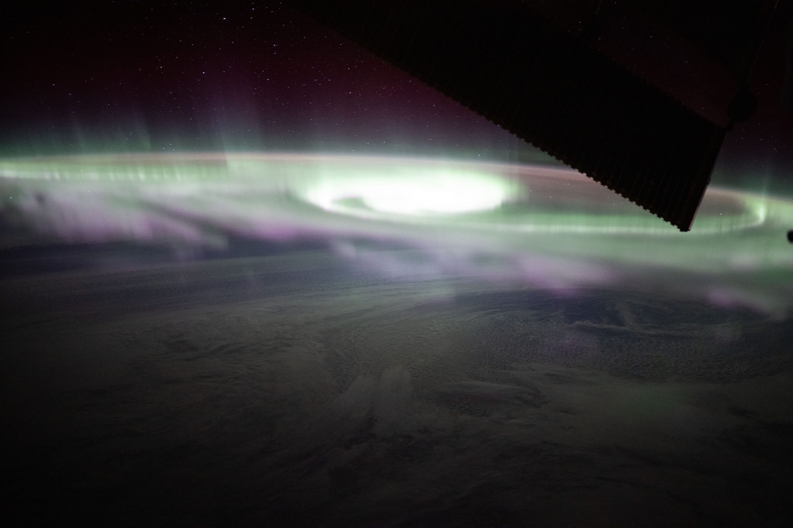
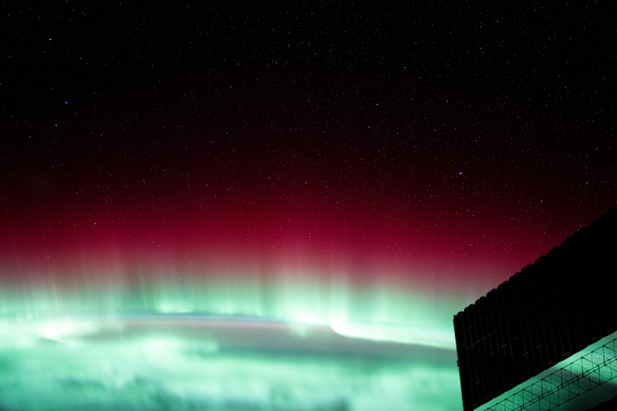
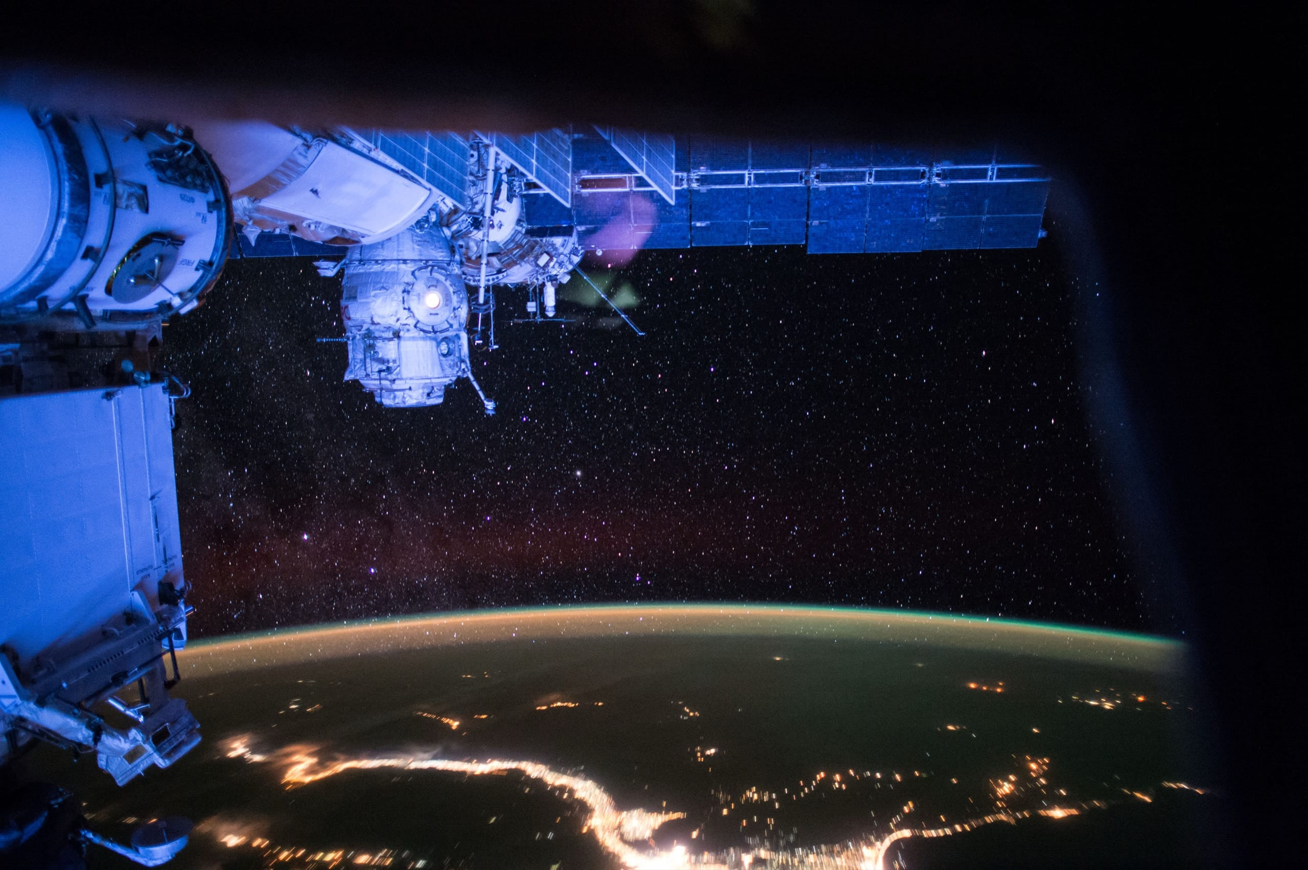
--zoom-padding- Space between the zoomed image and the screen edges
--zoom-image-radius- Corners of the zoomed image
--zoom-button-size- Size of the arrows and the close button
--zoom-button-radius- Shape of the buttons and the navigation bar
--zoom-controls-offset- Distance from the controls and the caption to the screen edges
--zoom-caption-max-width- Widest the caption can get
--zoom-caption-font- Font family of the caption
--zoom-caption-font-size- Font size of the caption
--zoom-caption-radius- Corners of the caption box
Theming
The overlay follows the light or dark preference of the system. Change its colors for one gallery with the theme prop or with CSS variables around it, or for the whole site with the same variables on :root.
Playground
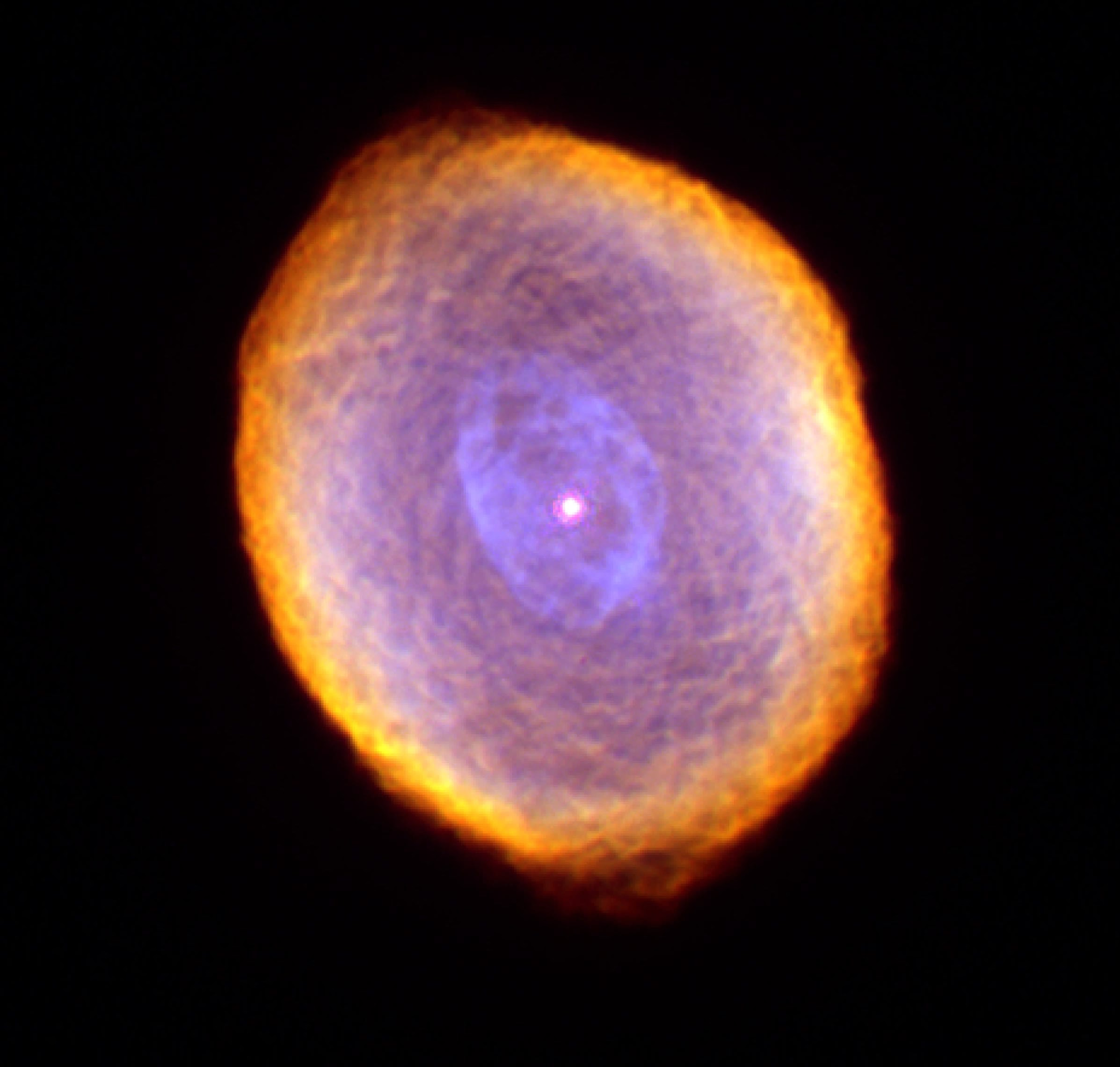
Change a value and open a photo. The code to copy updates as you go; the variables only apply to this gallery.

/* Change a value to see the code */The theme prop

<ImageZoom theme={{
  backgroundColor: '#050a1a',
  closeButtonColor: '#8ecbff',
  navigationColor: '#8ecbff',
}}>
  …
</ImageZoom>
CSS variables
When a gallery opens, the overlay takes the --zoom-* values found around it. Thetheme prop wins over them.
/* The whole site */
:root {
  --zoom-bg: rgb(5 8 20 / 0.97);
}

/* One gallery: <ImageZoom class="portfolio"> */
.portfolio {
  --zoom-padding: 5vmin;
  --zoom-image-radius: 12px;
}
Colors
--zoom-bg- Overlay background
--zoom-close-color- Close icon
--zoom-close-bg- Close button
--zoom-nav-color- Arrows and counter
--zoom-nav-bg- Navigation bar (or each arrow in the sides layout)
--zoom-caption-color- Caption text
--zoom-caption-bg- Caption box
Color scheme and motion
--zoom-color-scheme- Set dark or light to follow your own theme toggle instead of the system
--zoom-animation-duration- Zoom animation; the animationDuration prop wins over it
--zoom-slide-duration- The glide to the next image with the arrows and keys
--zoom-slide-easing- Its easing
The layout variables are listed under Spacing and controls.
Parts
The overlay lives in a shadow root, so the CSS of your site can't break it: generic rules such as button { all: unset } or svg { width: 1em } never reach it. The variables cross into it; for anything else, style its parts with::part().
astro-image-zoom-overlay::part(caption) {
  text-transform: uppercase;
}overlay- The
<dialog> backdrop- The background behind the image
track- The carousel that holds the slides
slide, image- Each slide and its image
caption- The caption
close- The close button
toolbar- The navigation bar
nav, prev, next- The arrows (
navmatches both) counter- The position in the gallery
See the zoom with its default styles, and with hostile CSS that breaks the rest of the page.
API
Props
themebackgroundColor,closeButtonColorandnavigationColorfor this galleryanimationDuration- Milliseconds; overrides
--zoom-animation-duration showNavigation- Arrows and counter in galleries
navigationLayout- Arrows and counter in a bar at the bottom, or arrows at the sides of the screen
showCounter- Position in the gallery, such as “3 / 8”
showCaption- Caption of the zoomed image
captionPosition- Where the caption sits on the screen
keyboardNavigation- Arrow keys move through the gallery
closeOnBackdrop- A click beside the image closes it
closeOnImage- A click on the image closes it
closeOnScroll- Scrolling or a vertical swipe closes it
class- Class for the
<astro-image-zoom>element
Image attributes
data-zoom-src- Full-size image for the zoom. Needed when the image on the page is resized
data-zoom-caption- Caption shown with the zoomed image; on the
<a>itself for a link withdata-zoom data-zoom- On an
<a href>around an image: the zoom opens itshref. The component leaves the link as it is